Improve Your eCommerce Conversion Rates – 6 Changes You Can Make TODAY!
If you ain’t convertin’, you’re sunk. As any properly optimized eCommerce store knows, it’s all about the conversions. Even a single-percentage increase in conversions can add up to THOUSANDS in revenue.
But if you don’t take steps to make the user’s experience hassle-free and convenient, they’ll probably end up shopping somewhere else– and that means your sales are going to plummet faster than a giraffe on roller skates…
Ouch.
The good news is that you don’t have to let that happen. There are things you can do right now, TODAY to start improving that conversion rate.
Strap yourself in – we’re going to move fast and furious towards getting you that next percentage that’ll put more bucks in your pocket.
1. Stop Forcing Registration Before Purchase.
Forcing registration before a purchase is made is kind of like asking someone to marry you before you’ve even gone on a date – it’s too soon, so it scares customers off.
Think about it: All a new customer really wants to do is buy the awesome product you’re selling.
In the early stages of your relationship, they probably aren’t interested in entering a long-term commitment with your brand, and they definitely don’t want to deal with the hassle of entering their information.
You need to give them the time and space to experience your brand on more levels before you force them into registering – even if registration means more points of contact for you down the line (which is tempting, I know).
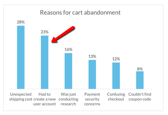
It’s totally understandable that you want to collect email addresses from the people visiting your site, it has been proven that the checkout is the wrong place to do it. 23% of users will abandon their shopping cart if they are required to create an account.
One company even made a three hundred million dollar profit by simply removing the registration requirement for their customers. (Check out their story here!)
So – if you’re forcing people to register before they buy… stop.
Instead, let shoppers make a purchase as a guest. Don’t worry – you can still ask them for their info once the purchase is complete, which is a much better time to convert them into long-term, loyal brand advocates than right out the gate.
2. Create a Sense of Urgency.
Apathy is a conversion killer. As buyers, we tend to rest on our laurels until the last moment, buying only when we’re either inspired or we HAVE to.
There’s plenty of evidence that proves urgency has a positive impact on sales, including a notable study by Marketing Experiments that tested three ways of incentivizing offers:
- Adding a time-sensitive $100 savings (with an actual deadline) increased enrollment by 992% for an online course
- Showing the quantity of the item available boosted conversions for one eCommerce shop by 508%
- Implying urgency by showing a date-stamp on the product page of a “lowest price” deal raised conversion rates by 10% for 48 hours after the page’s initial launch.
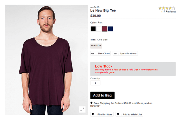
If you can create a sense of urgency, shoppers will be more likely to purchase an item on impulse. Check out how American Apparel does this on their site with a scarcity tactic:
Did you spot the scarcity trigger? It’s that “low stock” warning. As a buyer, if you know that stock is running out, you’re more motivated to go ahead and buy now instead of putting off the purchase until later (when you might miss out!)
To create a sense of urgency like this on your site, include information about how many products are left (either a countdown showing the exact number or a “low stock” warning like the American Apparel example).
That way, customers feel like they’ll miss out if they don’t take immediate action by making a purchase.
Need Help With Your eCommerce SEO?
Search engine optimization for eCommerce websites is our specialty. No matter what eCommerce platform you’re on, we’ve worked with it, we’ve ranked it and have learned a great deal along the way!
3. Less Required Form Fields.
Every second your customers have to spend filling out a form is a second they might spend re-thinking their decision to buy from you.
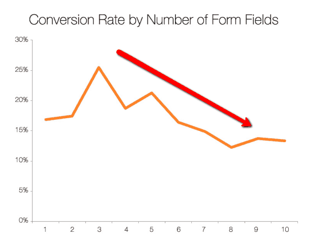
We’re all pretty private about our information, wary of sharing too much online without being certain that our information will be respected. We pretty much expect to get spammed, and don’t like dishing out unnecessary details.
Think critically – do you really need all of the information you’re asking for? Both email AND phone numbers, for example? Evaluate what you’re asking for to find ways to cut down.
One way to reduce the number of form fields that your customer needs to fill out is to have their city and state information auto-populate once they’ve entered their zip code.
This might seem like a small change, but it can pack a hard punch. After TrafficSafetyStore.com did it, they saw an immediate 38.74% increase in conversion rate and brought in an additional $43,230 in revenue over a 2 week period!
But don’t stop at auto-populating the city and state info. Make sure customers can also check a box to “Use the same shipping address as billing address.”
Remember, less hassle means the customer will be more likely to finalize their purchase!
4. Offer Free Shipping.
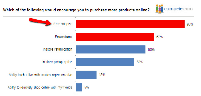
This is arguably the most powerful way to boost conversions and increase your sales, with multiple studies proving it has a serious impact on buying numbers.
People love free shipping – so tons of major companies, like Amazon and Nordstrom, have started to offer it in some form.
And it’s easy to understand why.
A study on shipping costs showed that 93% of respondents said that free shipping would encourage them to make more online purchases. On top of that, overall customer satisfaction was 10 percentage points lower for those who paid shipping when compared with those who did not.
So, if you want happy customers who are willing to buy from you often (hint: you DO), offering free shipping is the way to go!
5. Make Sure Your “Buy” Buttons Stand Out.
Your eCommerce website should make the user experience as simple, straightforward and intuitive as possible. If customers have to spend more than a second looking for your “Buy” button, you’re doing it wrong.

Here’s how to make sure your “Buy” buttons catch the eye of every customer who visits your site:
- Choose the right color – Yes, you’ve probably read plenty about how “X” color converts better than Y – but for the most part, it’s more about contrast than anything. The color of the buttons should contrast with the background and stand out from the other buttons on your site.But if you’re REALLY not sure what color to use, consider choosing red (unless the rest of your site is red). Hubspot ran a test on button color and found that red outperformed green buttons by 21%, and other studies have shown similar results.Don’t get hung up on this. Start with contrast, and if you need a baseline, test red against something else. Don’t settle just because a blog post told you to (no matter how smart!)
- Be consistent – Your “Buy” button should show up in the same location and color on each product page. That way, your customers know exactly where to find it and won’t waste time hunting around.
- Pick a font that’s easy to read – While you don’t have to use giant text, you should pick a color and size that’s easy to read against the background color of your buttons. If your button is red, for example, try a thick, white font.
If you’re looking to amp up your conversion rates even more, consider A/B testing other attributes of your button, like its shape and placement.
6. Speed Up Your Site.
If your website is slower than a sloth swimming treading water in a pool of molasses, you can’t expect your customers to stick around for the “fun”.
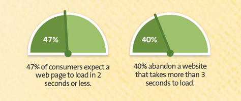
In fact, research performed by KISSMetrics shows that a load time of over 4 seconds causes page abandonment to increase by over 25%. That’s over ¼ of your potential customers leaving your website just because it’s slow!
I can hear your bottom line cringing from here.
The first step to fixing your slow website by using a speed test tool like Pingdom (or better yet, the site speed tool from Google) to see how long it takes your website to load.
Google’s tool will spit out suggestions to optimize your site performance, but in general, some places to start:
- Optimize your images – Crop all images to the correct size instead of using any that are larger than what’s necessary, and avoid using BMPs or TIFFs. JPEGs are typically the best option.
- Enable caching – When you enable caching, your page will load faster for people who have already visited your site because the browser won’t have to request the file from the server. If your site was built in WordPress, use the WP Super Cache plugin to enable caching.
- Get rid of unnecessary plugins (if you’re using WordPress) – All of those plugins you’re using could be slowing your site down quite a bit, so be sure to delete the ones you don’t need. Use the P3 plugin, which profiles the performance of your other plugins, to determine which ones you can remove from your site.
And remember – Google penalizes slow websites, so load speed isn’t something you should take lightly. Even half of a second could make all the difference.
Track Everything!
Whatever changes you decide to make, be sure to track their effectiveness and find what works for your target audience.
While many human behaviors can be predicted, some will surprise you. Perform A/B tests and regular research to improve your eCommerce website whenever you can, and you can feel confident knowing that your conversion rates will improve too.
Have you made any of these changes to boost conversion rates? What were your results? Share in the comments section below!
