Conversion Optimization: You’re Probably Doing It Wrong
The science of conversions can be a tricky one. Not everyone has the right idea on how to optimize a page for conversions, but then again not everyone has the wrong idea. The conversion funnel is different from website-to-website, from demographic-to-demographic and even from industry-to-industry. There’s no cookie cutter technique…but there are best practices for ensuring your page is getting the conversions it deservers.
Always choose “Testing” over “Rule of Thumb”
Pretty often it’s believed (and religiously followed) that rule of thumb theories are always right. But that’s wrong! Though it may work for a majority of sites out there, and even if its worked on your website – that doesn’t mean it’s the most optimized tactic. For example, it’s commonly known that faces draw attention in imagery, and faces looking a certain way help people focus their attention in that direction.
The following eye gaze tests prove otherwise.
The lesson here is simple…test test test!! It will always give you the best results. eyequant.com
The 4 Key Principles to Conversion Optimization
The following are 4 Key Principles in conversion optimization that are to be taken as GUIDES to help you hone in on well polished tactics.
1. DESIGN
EVERYBODY loves to talk design, but did you know there’s a complex cognitive science behind it? Its important to keep in-mind the elements of design where it serves a PURPOSE towards great user experience, which thus leads to conversions.
- Remove Mystery: Don’t let your fancy slogan over take your informative headings. All your copy should be clear, concise and organized.
- Economy of Form: Use less to accomplish more or the “White space theory”
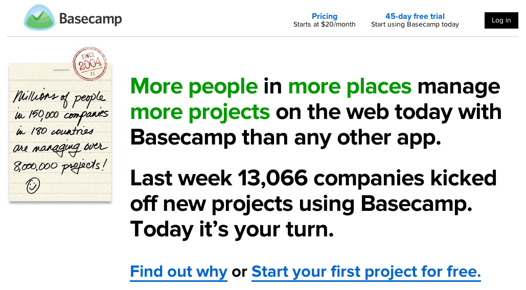
Don’t fill your landing page with every piece of content, graphic and spectrum of color available. But also at the same time, don’t take out so much that it becomes hard for someone to know what your service or product is. It’s important to – use less to accomplish more.
Basecamp.com landing page. - The Holy F Rule: Heat maps, eye gazing & mouse tracking.
Humans can be unpredictable. Use tools like CrazyEgg.com to track where your users are focusing. Always keep in mind the F rule –people read left to right and also like to skip around. Place your copy and imagery strategically.
Results of an eyegaze tracking test. - Colors can also make or break your conversions. Different colors and color combinations make people FEEL different things. Banks use blue tones to ensure a sense of security and safety. Ecommerce stores use red during a sale to create a sense of urgency.
And always test different colors. optimizely.com
2. FLOW
Imagine for a second you’re a traffic conductor, and you’re directing hundreds of cars so they can get to their destination without any trouble. The same principles applies to websites. Make your landing page elements be the traffic conductor; the flow should direct a user to the end goal without any hassle, trouble or friction. The easier your flow is, the faster and more effectively your users will go where you want them to go.
-
- Dialogue: talk to people as if they were 5 years old.
Remove mystery! Your landing page is the dialogue between you and the customer. The customer is looking for an answer to a question, and it’s your job to make sure you answer that…simply and clearly.
- Dialogue: talk to people as if they were 5 years old.
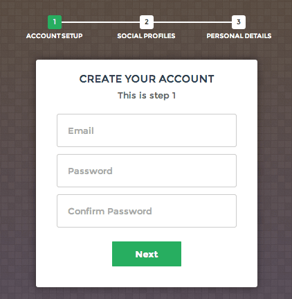
- Fewer steps: The fewer steps the better. Complicated navigation structure, confusing sign up methods cause people to lose interest, get irritated and leave. Long paragraphs and thousand step forms annoy people to a point where they give up and find an easier alternative. Make it easy for someone to get what he or she wants.
3. CALL
The call is one of the last parts before a user takes action…so make it count. Use headlines that are to the point and direct an upcoming action. Remember people “scan” so make it short and sweet.
- Add value to the user: Have a phone number for them to reach you, show off your “awesome support team”, put a face behind the company, and overall make the user trust you before anything else.
- Forming your Headlines: Different headlines work different for different goals. Generally, be sure to make it specific, succinct, focus on ONE thing, and quickly reflect the expectations of the visitor. http://unbounce.com/Removing a “pain” headline example:
Get the [Rarely Seen But Relevant Adjective] Power of [What Your Product Does] Without [Pain]
becomes… - Don’t forget your user: User segmentation and profile development will help narrow down headlines and calls making them more targeted towards that specific user.Example: A bakery site can have two different users:
- A baker who bakes at homes, looks for recipes online and shares tips and tricks.
- A consumer who loves eating sweets and is looking to buy some for themselves, or their office, or their friends
Obviously these are two completely different people with completely different motives. Understand their motives and intentions and create a targeted call or headline to make them feel more secure in making a decision. Digging deeper into user intent, on page factors heavily rely on schema markup, so make sure you impliment them where you see neceissary.
4. ACTION
Here we go, this is the last step, someone’s going to click and you’re going to get a conversion. Let’s make it count!
- Buttons: Your action buttons should dictate what’s going to happen next. Instead of a simple “Click Here”…try using “Click Here to Start Your Free Trail”. usertesting.com
- Use the halo effect: everything that will happen next will be good a something that lasts.
- Remove FUDS (fears, uncertainty and doubts): Add trust elements like “security” logos where necessary. Add testimonials where and when users might start questioning the merits of your business.
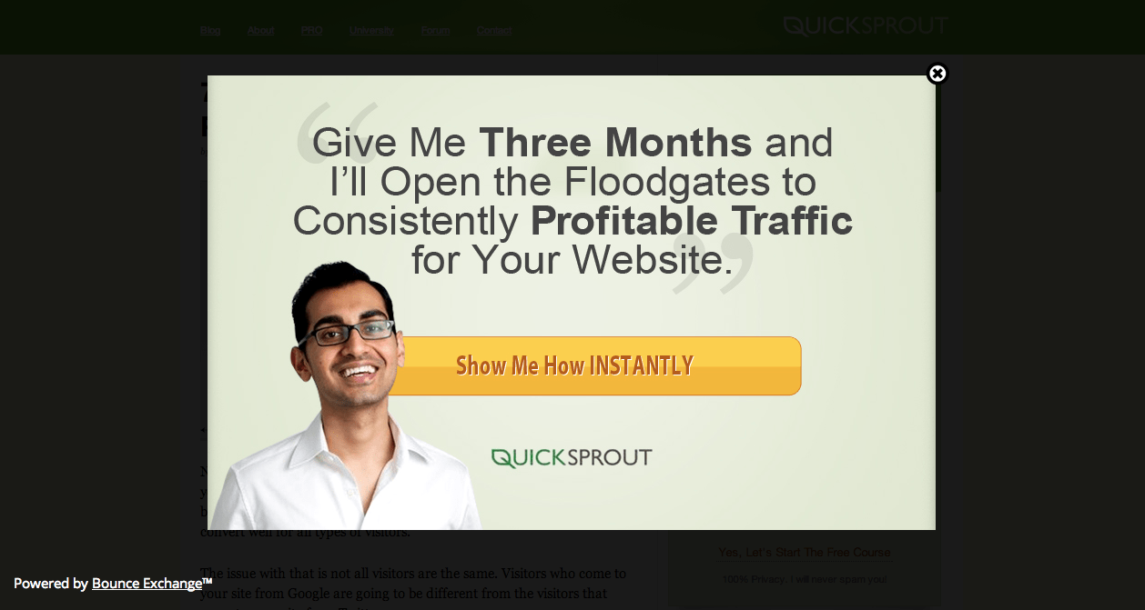
- Pop-Ups Work: not those annoying pop-up ads we saw in the early 2000’s, but sexy pop-ups, that variably appear at the right TIME on the right PAGE and is ONLY there to add value to the user.
This popup only appeared after I spent time reading the article, then quickly scrolled up and tried exiting. - Form Optimization: Best advice for form testing is extremely subjective to the form and the type of user. But visually, there are some essentials you should follow.
- Inline text will make it look shorter and simpler
- User conditional formatting to show and hide fields (variably) to a specific user
- If it’s a registration form, use simple “login with Facebook or Google” buttons
- If your form has to be long, break it up into clean & clear sections
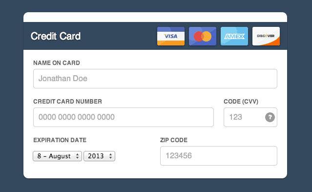
- Remove any redundant or extra steps (especially for payment or e-commerce forms)
Post Conversion…Conversion Optimization
What?! You thought you were done at the conversion, right? NOPE! Big deal, you got a form submission, or sale…now what? Here are a few things to keep in mind after your initial conversion.
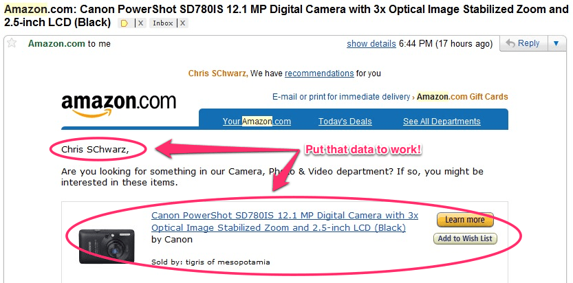
- Use smart follow up email techniques to send them emails (not too many) to ensure they’re on the right track. Example: (1st email has their name in the subject line and welcomes them) (2nd email may come after a few weeks of inactivity to follow up and see if they’re still interested) (3rd email may ask how the product or services were, and if maybe they had some issues).
- For e-commerce, use special coupons and offers for existing customers, returning customers, or inactive customers to get them to buy more or share more.
Remember though, most importantly of all…optimize for revenue, not conversions. Business is business. Make sure your conversions don’t stagnate, but also keep increasing in numbers and keep increasing your revenue.
